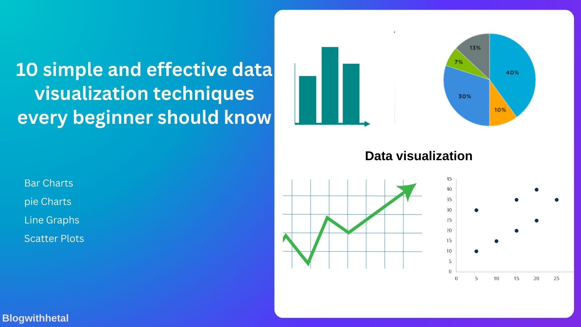
Explore the 10 simple and effective data visualization techniques that every beginner should know to enhance understanding, analysis, and presentation of data.
In today’s data-driven world, visualizing data is more important than ever. Whether you’re working in business, education, or research, being able to communicate data effectively is essential. However, for beginners, understanding how to choose the right technique can be overwhelming. This guide will break down 10 simple and effective data visualization techniques that every beginner should know.
By mastering these techniques, you’ll be able to turn raw data into meaningful insights and easily communicate your findings to others. From bar charts to scatter plots, we will explore each method’s benefits and provide tips on how to get started.
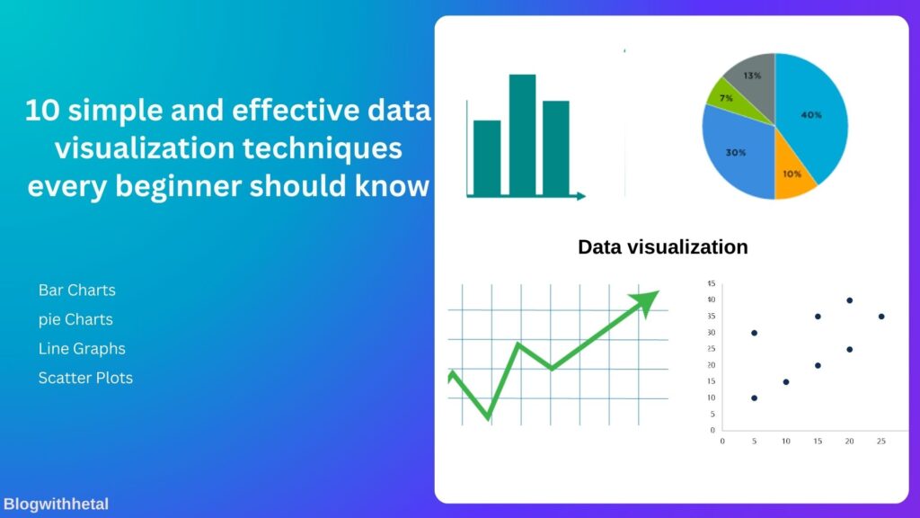
1. Bar Charts: A Beginner’s Go-To Visualization Tool
Bar charts are one of the most basic yet effective visualization tools for beginners. They are commonly used to compare categories of data and are great for showing differences in quantity.
Key Benefits:
- Easy to understand.
- Useful for comparing multiple categories.
- Ideal for showing trends over time or across categories.
Example:
A simple bar chart could compare sales data across different months, showing which months had the highest or lowest sales.
How to Create a Bar Chart:
- Use tools like Excel, Google Sheets, or Tableau.
- Make sure to label your axes clearly (e.g., months on the x-axis and sales figures on the y-axis).
2. Pie Charts: Ideal for Showing Proportions
Pie charts are a great way to visualize data that is divided into categories, making them easy to read and interpret.
Key Benefits:
- Useful for showing parts of a whole.
- Best for fewer categories (ideally 4-6 slices).
- Helps to quickly see proportions.
Example:
A pie chart might show the distribution of sales among different products. If you’re presenting market share data, a pie chart will allow you to visualize the proportion of each company’s share of the market.
How to Create a Pie Chart:
- Most spreadsheet programs have an easy-to-use pie chart function.
- Choose categories that sum up to 100% for accurate representation.
3. Line Graphs: Tracking Changes Over Time
Line graphs are excellent for tracking data trends over time. They allow you to visualize how one or more variables change over a continuous range.
Key Benefits:
- Perfect for showing time-based data.
- Helps identify trends, such as upward or downward movements.
- Can track multiple data series simultaneously.
Example:
A line graph could track the performance of a stock over the past year or show changes in temperature over several months.
How to Create a Line Graph:
- Plot data points on a graph with time on the x-axis and the variable you’re measuring on the y-axis.
- Use different colors for different lines if comparing multiple data series.
4. Scatter Plots: Understanding Relationships Between Variables
Scatter plots are used to show relationships or correlations between two variables. They’re an excellent way to visualize the relationship between variables and are widely used in data analysis.
Key Benefits:
- Useful for showing the relationship between two variables.
- Helps to identify correlations or trends (positive, negative, or no correlation).
- Effective for spotting outliers in the data.
Example:
A scatter plot could show the relationship between hours of study and test scores, helping to identify if there’s a positive correlation.
How to Create a Scatter Plot:
- Place one variable on the x-axis and the other on the y-axis.
- Plot data points on the graph and look for any obvious trends or patterns.
5. Heatmaps: Visualizing Intensity of Data
Heatmaps use color to represent data, with color intensity indicating the magnitude of values. They’re great for identifying patterns in large datasets.
Key Benefits:
- Perfect for visualizing complex data.
- Highlights areas with high or low intensity.
- Useful for identifying trends across large datasets.
Example:
A heatmap could show the frequency of website visits at different times of day, with warmer colors representing peak traffic times.
How to Create a Heatmap:
- Use software like Excel, Google Sheets, or specialized tools like R or Python.
- Ensure the colors are well-chosen to reflect the intensity of the data (e.g., dark colors for higher values).
Conclusion: Mastering Data Visualization Techniques
In this blog, we’ve explored 10 simple and effective data visualization techniques that can help beginners turn raw data into meaningful insights. These techniques will enhance your ability to communicate data clearly and make more informed decisions.
The key takeaway: start with simple charts and gradually work your way to more advanced techniques. With practice, you’ll become proficient in using various data visualization tools and techniques.
If you’re ready to take your data analysis to the next level, try using these techniques in your next project or presentation. As you practice, you’ll not only improve your skills but also gain confidence in presenting your findings clearly and effectively.
FAQs: Data Visualization Techniques for Beginners
1. What is data visualization?
Data visualization is the graphical representation of data to help people understand patterns, trends, and insights from data.
2. Which data visualization technique is best for beginners?
Bar charts and pie charts are often the easiest for beginners to use and understand.
3. Do I need special software for data visualization?
No, many free and simple tools, like Excel and Google Sheets, offer basic data visualization features.
4. How do I choose the right chart for my data?
The type of chart you choose depends on the kind of data you have. For example, use bar charts for comparisons, line graphs for trends, and pie charts for proportions.
5. Can I use these techniques for business presentations?
Absolutely! Data visualization is especially powerful for business presentations, helping audiences easily understand complex data.